
 EN
EN
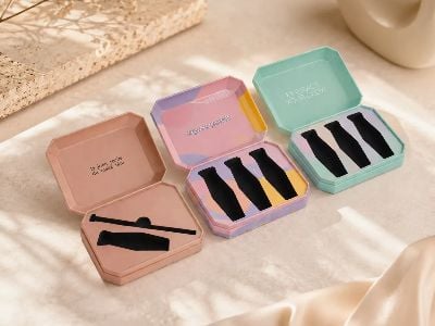
Custom printed paper packaging is a special way to make boxes and bags that look good and keep products safe. When people see a package, they often notice its colors first. That's why it's important to choose the right colors for custom packaging. At Senlarry Packaging, we know how colors work, and we want to help you understand them too. Two common ways to make colors are CMYK and Pantone. Each has its own purpose and can help you create amazing custom packaging that stands out.
What You Need to Know About CMYK and Pantone Colors?
CMYK stands for Cyan, Magenta, Yellow, and Key (Black). This color model is used for printing because it mixes these four colors to create many different shades. Imagine mixing paint. If you combine different amounts of these colors, you can get a wide range of colors. That's what happens with CMYK printing! It's great for full-color images and designs. For example, if you want a bright photo of a fruit basket on your box, CMYK can help create those colorful details. However, CMYK can sometimes change colors slightly, depending on the printer or paper. This means if you want the exact same color each time, you might need to check it carefully.
On the other hand, Pantone colors are like a special color guide. Each Pantone color has a specific code, making it easy to find that exact color every time. If you want your custom product packaging to match your brand’s colors exactly, Pantone is the way to go. For instance, if your logo is a specific shade of blue, using a Pantone color will ensure that your blue looks the same on every package. This is super important for brand recognition. If someone sees your color, they should think of your brand right away.
Choosing between CMYK and Pantone can be tough. It really depends on what you want. If you have a colorful design with lots of pictures, CMYK might be better. But if you need certain colors to be perfect, Pantone is the best choice. At Senlarry Packaging, we can help you figure out which method is best for your custom packaging needs.
How to Choose the Right Color Model for Your Custom Packaging Needs?
Choosing the right color model for your custom packaging is important. It helps your products look their best. First, think about your product. If it has a lot of colors or images, like a cereal box or a gift bag, CMYK is usually a good fit. This method allows for vibrant colors and can create detailed images. For example, if you want your packaging to show a beautiful landscape or a fun character, CMYK can bring those designs to life.
Next, consider your brand. If your brand has specific colors that you always use, Pantone is the way to go. This ensures that no matter what, your colors stay the same. For example, think of a popular brand that always uses a certain shade of green. If they used CMYK, that green might change a bit from one print to the next. With Pantone, they can avoid this problem.
Another thing to think about is the material you will use for your packaging. Some materials absorb ink differently, which can affect how colors look. For example, a shiny box might make colors look brighter than a matte box. Talking to experts, like those at Senlarry Packaging, can help you choose the best material and color model.
Finally, budget matters too. CMYK printing is often cheaper for large projects, while Pantone colors can be more expensive but provide exact matches. It’s all about what you need. At Senlarry Packaging, we are here to guide you through these choices. We want your custom printed paper packaging to be perfect for your brand and product.
When creating custom printed paper packaging, it’s important to know what to avoid to make sure your product looks its best. One big mistake is using too many colors. While it can be fun to have bright and different colors, too many can make your printed packaging boxes look messy. It’s better to stick to a few colors that match well together. This keeps your design clean and easy to understand. Another thing to avoid is choosing colors that don’t match your brand. If your brand is known for blue and yellow, using bright pink can confuse your customers. They may not recognize your product right away. Also, make sure to avoid using low-quality images or designs. If your images are blurry or pixelated, it can make your packaging look unprofessional. Instead, always use high-quality graphics that represent your brand well. Finally, don’t forget to check colors on different types of screens. Colors can look different on a computer screen compared to printed paper. Always get a sample printed before making a large order. This way, you can see exactly how the colors turn out. By avoiding these common mistakes, you can create packaging that not only looks good but also represents your brand accurately.
Color consistency is really important for any packaging brand.
When your colors are the same every time, it helps people recognize your product easily. Imagine if your favorite snack changed its package color every time you bought it. You might not even notice it was the same snack! Keeping your colors consistent helps build trust with your customers. They know what to expect and feel more comfortable buying your product. Good color consistency also makes your brand look more professional. When all your products look alike, it shows that you care about your brand and your customers. This can lead to more sales and loyal customers. Another reason color consistency is essential is because it helps your packaging stand out on the shelf. If all the products around yours are different colors, a consistent look can grab attention. It’s like a team wearing matching uniforms—they look organized and ready to play! In addition, maintaining color consistency can also save you money in the long run. If you keep using the same colors, you won’t have to change your designs often. This means you won’t have to spend extra time and money on new artwork or printing. Overall, color consistency helps create a strong brand identity that customers will remember.
Conclusion
To achieve perfect color accuracy in wholesale custom packaging, there are several steps you can take. First, it’s important to choose the right color system. There are two main types: CMYK and Pantone. CMYK stands for Cyan, Magenta, Yellow, and Black. This color system is used mainly for printing. It mixes these four colors to create a wide range of colors. Pantone, on the other hand, uses specific color codes to match exact colors. If you want a particular shade, Pantone can help you get it every time. Once you decide on a color system, create a color guide. This guide should show the colors you want to use and how they look together. Share this guide with your printer to ensure everyone is on the same page. Another tip is to always request a proof or sample before the final print run. This sample will show you how the colors will look on your actual packaging. If something doesn’t look right, you can make changes before the full order is printed. Additionally, keep in mind the type of paper you are using. Different papers can affect how the colors appear. Always test your colors on the actual paper that will be used for your packaging. Finally, work closely with your printing team. Good communication can help you catch any issues early and ensure everything comes out just as you imagined. By following these steps, you can achieve perfect color accuracy and create beautiful, eye-catching packaging with Senlarry Packaging.